TLDR
- Start with the tone of the event and the needs of the design, not with whatever paper sounds fanciest.
- Weight, surface, and finish are the three paper choices that affect the final result most.
- Heavier is not always better. Smooth is not always better. And the thickest stock in the room is not automatically the wisest choice once postage enters the chat.
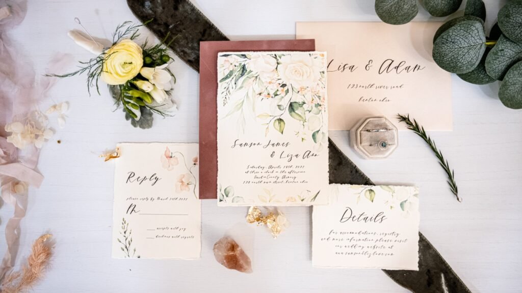
Most couples do not care about paper until they hold the first sample in their hands. Then they care immediately. That makes sense. On a screen, paper is abstract. In real life, it is the invitation. It affects the weight, the feel, the sharpness of the print, the way colors read, and the first physical impression the piece makes. People may not know the name of the stock, but they absolutely know when something feels flimsy, glossy in the wrong way, or much nicer than they expected.
That is why choosing paper for wedding invitations is less about mastering stationery jargon and more about making three smart decisions: how substantial you want the piece to feel, what surface works best for the design, and whether the finish supports the tone of the event. Once you understand those three variables, paper selection gets much less mystical and much more manageable.
Start with the tone of the event
Before you think about weights and finishes, decide what the invitation is trying to feel like. Formal black-tie wedding? Softly traditional garden party? Clean modern city event? Photo-forward save the date? The right paper is partly a design decision, but it is also a tone decision. PrintInvitations says smooth papers often suit clean, modern layouts, while heavier stocks can add more structure and presence. That is a helpful way to think about it because paper is doing some of the emotional work before anyone even reads the words.
This also keeps you from choosing paper backward. A lot of people start with “What is the most premium option?” and only later realize the design would have looked better on something simpler. A minimal invitation with excellent typography often wants a clean sheet and good printing. A romantic or more decorative design may benefit from a little more softness, texture, or sheen. Paper should support the design, not compete with it.
Weight is the first big decision
Weight is what most people notice first, even if they do not have the vocabulary for it. Heavier stock feels more substantial. That is not marketing poetry. It is just physics. PrintInvitations says heavier stocks tend to feel more substantial, and The Knot’s current paper help page describes its standard invitation paper as a 120 lb, 17 pt thick card stock with a matte eggshell finish. That makes a useful reference point: it is not featherlight, not cartoonishly thick, and solid enough to feel intentional.
Where people get into trouble is assuming that heavier always equals better. Sometimes it does feel better. Sometimes it just feels excessive, especially if the design is simple, the invite has multiple enclosure cards, or the mailing setup is already pushing size or thickness limits. The Knot notes that double-thick and triple-thick papers are more durable and help prevent creasing, but may require extra postage. USPS also reminds mailers that letters need to remain within specific size and thickness limits to qualify for standard letter pricing, and square or unusually shaped pieces can trigger a nonmachinable surcharge. In other words, thick paper can be lovely. It can also become a postage hobby you did not ask for.
Surface changes how the design reads
Once the weight feels right, the next question is the surface. Smooth papers tend to make typography and photos look crisp and clean. Slightly textured or matte eggshell papers can feel more classic and a little softer. The Knot’s invitation guide says its signature superfine card stock has a slightly textured matte eggshell finish, while its signature smooth option has a satiny feel and is especially well suited for displaying photos. That distinction is useful because it connects the paper choice to what is actually printed on the card.
That means photo-heavy designs usually benefit from smoother surfaces. Minimal modern invitations often do too, especially if you want sharp type, clean lines, and a more contemporary feel. Slightly textured papers can be great for classic or romantic styles, especially when the palette is restrained and the layout is elegant rather than image-driven. Neither is universally better. They just solve different problems.
Finish matters more than many people expect
Finish changes the personality of the invitation. PrintInvitations puts it well: a more reflective finish can add brightness and definition, while a softer finish can feel more understated and refined. The site also says finish affects how colors appear in the light, how bold or subtle the design feels, and how smooth the piece feels in hand. Those are exactly the differences couples notice when they are choosing between “clean and polished” and “a little more visual pop.”
This is also why there is no single best finish for every wedding invitation. A quiet black-and-ivory layout might look best with a restrained surface that lets the typography do the work. A brighter design or one with photos may benefit from a finish that helps color feel more lively. PrintInvitations also offers UV coating options, which it describes as a meaningful way to change both look and feel. The right finish is not the one with the most personality. It is the one with the right personality.
Paper should match the content, not just the vibe
This is the part people skip. The design itself should influence the paper choice. If the invitation relies on a lot of fine text, subtle color shifts, or delicate artwork, then print clarity matters a great deal. PrintInvitations says it uses HP Indigo printing because invitation design often depends on fine typography, soft color shifts, delicate artwork, and balanced layouts, all of which can get muddy when printing is not precise. That is a strong reminder that paper and printing should be chosen together, not as separate afterthoughts.
So if you are printing a crisp black text design, you may care most about readability and surface smoothness. If you are printing a photo card or an illustrated save the date, you may care more about color response and clarity. If you are building a more formal suite, you may care more about tactile presence and finish. Good paper choice is rarely about chasing a single adjective like “luxury.” It is about asking what this specific design needs to look right in person.
Do not ignore mailing reality
Paper choice is not just aesthetics. It affects how the piece mails. USPS says letters must stay rectangular and within certain size and thickness limits for standard letter pricing, and specifically notes that square greeting cards often cost extra because they are nonmachinable. That matters because the prettiest invitation in the world gets less charming once you are standing at the post office discovering that shape, rigidity, inserts, and thickness have all joined forces against you.
That does not mean you need to choose the thinnest possible stock. It means you should test one fully assembled suite before committing to a mailing plan. If you are using extra-thick paper, multiple inserts, belly bands, wax seals, or nonstandard envelopes, check postage early. Paper decisions look very different once they are multiplied by 120 households.
Proofs and samples are worth it when you are unsure
Paper is one of the few invitation decisions that is genuinely easier to judge in person. PrintInvitations includes a free digital proof with every order and also offers physical proofs or samples for a nominal fee, specifically noting that physical proofs can help customers compare paper feel, weight, print clarity, finish, and overall presence in hand. That is exactly the kind of step that saves people from choosing paper based only on how a mockup looked on a backlit screen.
This is one of the clearest advantages when you print invitations online through a shop that explains paper plainly and lets you proof before production. It turns a vague design preference into an actual decision you can see and hold. Or, to put it less elegantly, it helps you find out whether your “dream paper” is actually just very expensive cardboard with charisma.
A simple framework that works
If you want the short version, use this framework.
Start with the event tone.
Then look at the design: lots of text, lots of photos, or somewhere in between.
Choose a weight that feels substantial without creating mailing pain.
Choose a surface that supports the design.
Choose a finish that fits the mood.
Then proof it before you commit.
That is enough for most couples. You do not need a degree in paper. You just need a decent process and the discipline not to confuse “thicker” with “better” every single time.
FAQs
What paper weight feels nice for wedding invitations?
A useful reference point is The Knot’s standard invitation paper, which it describes as 120 lb, 17 pt matte eggshell card stock.
Is smooth or textured paper better?
Neither is always better. Smooth tends to suit photos and crisp modern layouts, while lightly textured or matte papers can feel more classic and understated.
Does thicker paper always look more premium?
Not always. Thicker paper can feel more substantial, but it can also add postage and may be unnecessary for simpler designs.
Should I get a physical proof?
If paper feel or finish matters a lot to you, a physical proof or sample is often worth it.