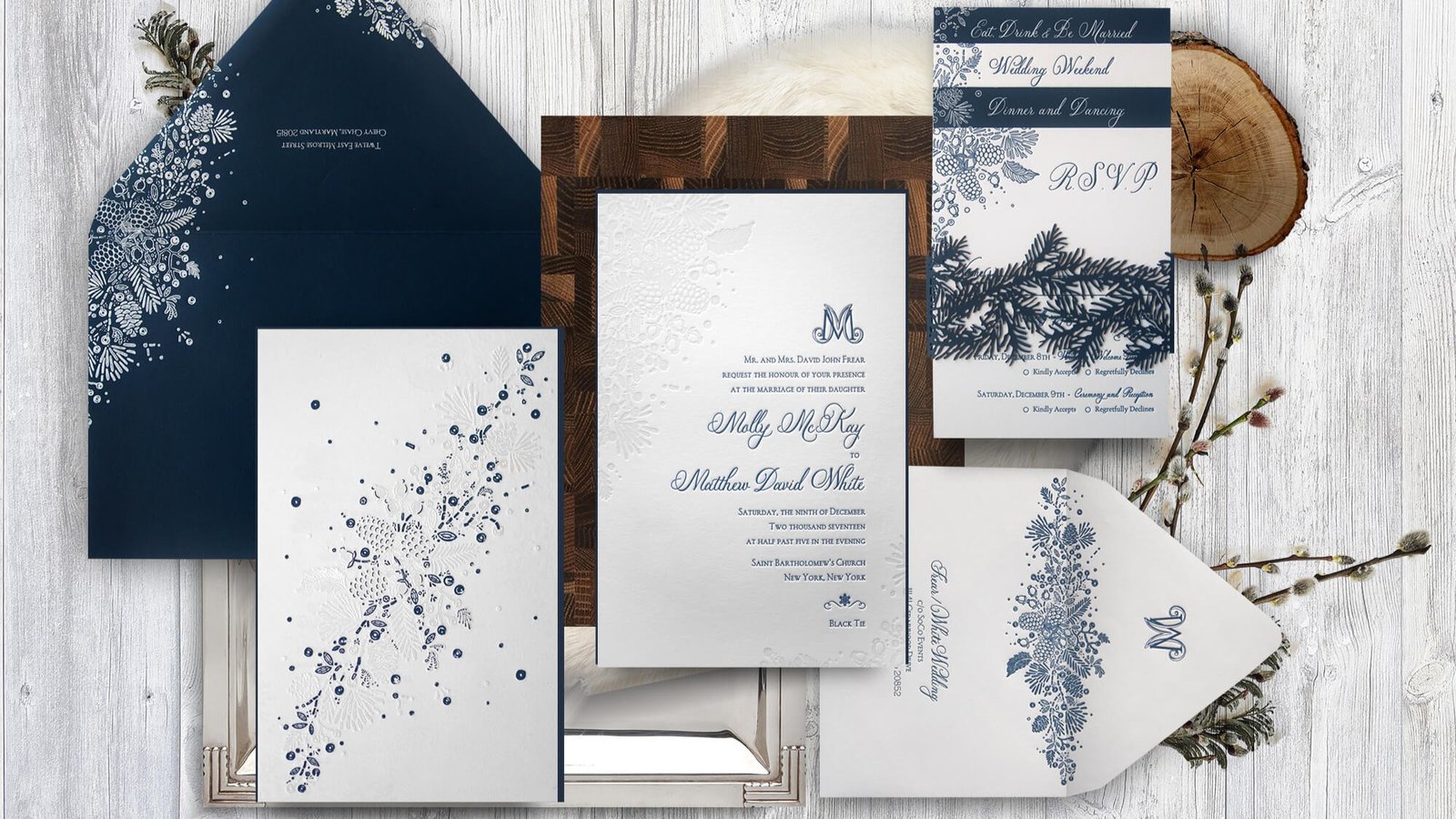
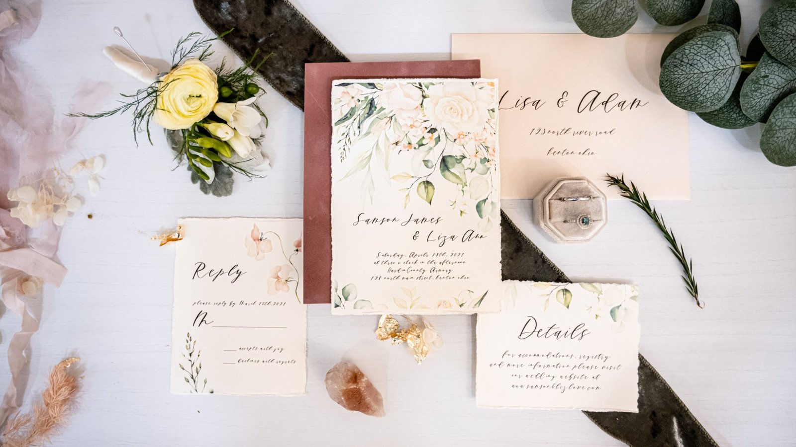
ERPNext is an open-source platform designed to simplify business operations. It helps organizations manage financials, customers, projects, and more—all in one place. Because it’s modular and flexible, it works for small startups and large enterprises alike. Some people might ask: why use ERPNext when so many other ERP systems exist? In my opinion, the openness […]
Author: John Monson

Majestic Purple Color: Everything You Need to Know
Rich, regal, and undeniably captivating, Majestic Purple (#4E2A84) is a deep and enchanting shade of purple that evokes feelings of luxury, mystery, and creativity. Its bold intensity makes it a favorite in design, fashion, and art, standing out as a color that commands attention without overwhelming. This article delves into everything you need to know […]

Coral Color: Everything You Need to Know
Coral is a vibrant, warm hue that strikes a balance between orange and pink, evoking feelings of tropical beauty, warmth, and energy. The color’s name originates from marine coral reefs, whose natural beauty and unique hues inspired this shade. With its hex code #FF7F50, coral has a cheerful and versatile charm that makes it stand […]

Lavender Color: Everything You Need to Know
Soft, serene, and timeless, lavender is a color that exudes tranquility and sophistication. With its gentle, muted tones, lavender (#D6CADD) has captured the hearts of many across cultures and disciplines, from design and fashion to art and psychology. In this article, we’ll explore everything you need to know about lavender, from its meaning and complementary […]

Moonstone Gray Color: Everything You Need to Know
Moonstone Gray (#979AA1) is a sophisticated and versatile hue, embodying subtle elegance and timeless appeal. This soft gray with subtle blue undertones is often associated with modernity, balance, and refinement. Its neutrality makes it an ideal choice for various applications, ranging from interior design to fashion and branding. What is Moonstone Gray? Moonstone Gray is […]

Midnight Teal Color: Everything You Need to Know
Midnight Teal (#003A4E) is a deep, luxurious color that combines the calmness of blue with the naturalness of green. It’s tranquil, mysterious and elegant so it’s a popular choice in design, fashion and decor. Midnight Teal’s versatility and subtlety makes it a timeless choice for those looking to add a bit of sophistication to their […]

Celestial Blue Color: Everything You Need to Know
Celestial Blue, a blue that’s as vast as the sky and as calm as the ocean, has been hypnotizing artists, designers and colour lovers for centuries. It’s a colour that’s both peaceful and full of life. Represented by the hex code #4997D0, Celestial Blue is elegant, calm and inspiring. Let’s get into the world of […]

Phthalo Green Color: Everything You Need to Know
Phthalo Green has been a go to for artists, designers and makers for decades. With its hex code #123524 this vibrant green has a rich history and many uses in design, art and culture. Let’s get into the world of Phthalo Green. What is Phthalo Green? Phthalo Green (phthalocyanine green) is a synthetic pigment introduced […]

Crimson Tide Color: Everything You Need to Know
Crimson Tide with its deep and bold hex code #990000 is a color that demands attention. Associated with power, intensity and elegance this color has cultural and emotional significance. Whether used in design, fashion or branding Crimson Tide evokes strong reactions and makes an impact. What is Crimson Tide? Crimson Tide is a deep rich […]

What’s the Difference Between Leopard and Cheetah Print?
Leopard and cheetah prints are two of the most iconic patterns in fashion and design, both inspired by their wild namesakes. Leopard print has intricate rosette-like spots—dark rings with lighter centres—that mimic the leopard’s fur. Cheetah print has solid black dots that reflect the cheetah’s sleek body. These patterns have gone beyond their natural origins […]

Red Color: Everything You Need to Know
Red is a colour of passion, energy and power. It grabs attention, evokes emotions and has deep meaning across cultures and contexts. As one of the base colours in the RGB and RYB colour systems, red is a fundamental part of design, art and visual communication. This post looks at the many sides of red, […]

How Complimentary Colors on a Color Wheel are Calculated
Complementary colors play a crucial role in art, design, and visual communication, creating striking contrasts and vibrant aesthetics. On a color wheel, complementary colors are hues that are opposite each other, creating dynamic visual effects when paired together. But how are these complementary colors calculated? Let’s delve into the science and artistic principles behind this […]