Picking pink sounds easy until you actually do it. Then you end up staring at twelve swatches that all look soft, romantic, and almost identical until one suddenly looks peachy, one looks beige, and one looks like it belongs at a baby shower. If you are trying to choose the best pale pink shades for wedding invitations, the good news is that you do not need all twelve. In my opinion, four shade families do most of the work: blush pink, dusty rose, pastel pink, and a barely-there nude pink.
The trick is that pale pink is not just about color. It is also about mood, season, typography, paper, and how the print will actually land once it leaves your screen. A pink that looks perfect on your phone can go flat in print. Another one that looks boring online can come out clean, warm, and expensive-looking in hand. That part matters.
If I had to narrow it down fast, I would say this: blush pink is the safest classic choice, dusty rose is the strongest if you want depth, pastel pink is great for airy spring suites, and nude pink is the quiet favorite for modern minimalist designs. That is the real short list.
Here is a quick comparison table to make the decision less annoying.
| Shade | General feel | Best for | Starting swatch |
|---|---|---|---|
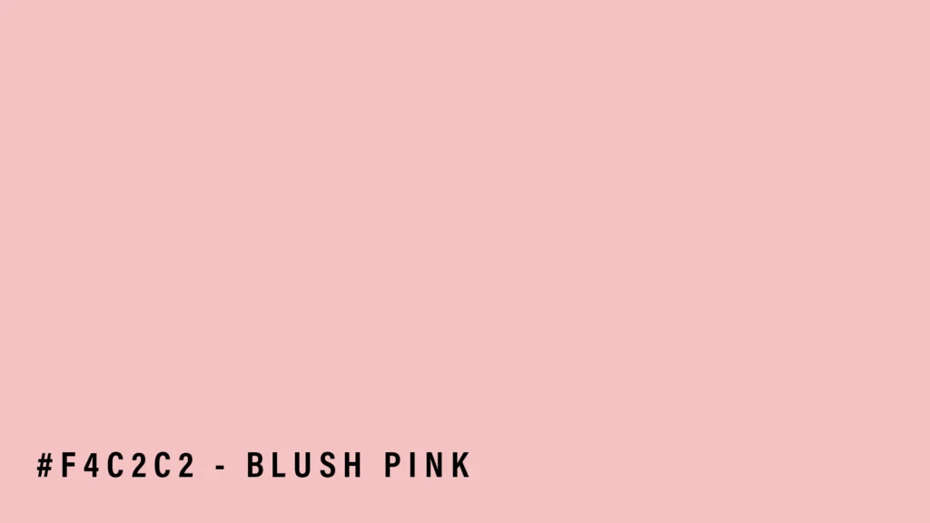
| Blush pink | romantic, timeless, soft | classic, garden, formal weddings | #F4C2C2 |
| Dusty rose | grounded, elegant, vintage-leaning | fall weddings, editorial looks, richer palettes | #DCAE96 |
| Pastel pink | airy, light, youthful | spring weddings, botanical suites, soft playful designs | #FFD1DC |
| Nude pink | subtle, modern, almost neutral | minimalist suites, serif typography, refined monochrome palettes | test as a custom swatch |
One note before we get into the details: treat those hex values as starting points, not sacred truth. Pale pink shades vary across color libraries, and paper plus finish will shift the result anyway.
Best pale pink shades for wedding invitations if you want the safest answer
If you want the easiest yes, go with blush pink.
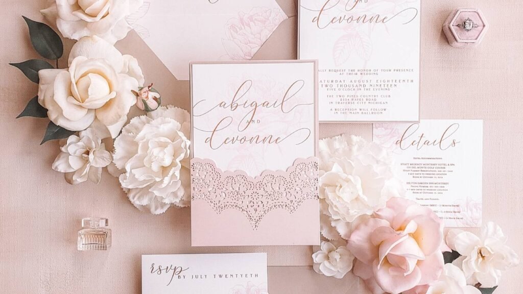
Blush works because it feels romantic without screaming for attention. It sits in that sweet spot where the invitation still looks soft, but not childish. That is probably why blush keeps showing up across wedding invitation collections and wedding inspiration galleries. It is flexible. It can lean formal with gold foil, soft and airy with white space, or slightly modern with black text and clean layout choices.
Blush is also forgiving. If your typography is traditional, blush supports it. If your layout is minimal, blush still makes the suite feel warm. And if your wedding style is somewhere between elegant and relaxed, which is where a lot of people actually live, blush usually fits without a fight.
I especially like blush when the invitation has one or two refined details instead of too much decoration. A delicate border, simple floral line art, or a monogram can be enough. Blush does not need a ton of help.
If you want to stay in this color family, Printiverse already has a useful breakdown in Blush Pink Color: Everything You Need to Know. It is a good next click if blush is already in the lead.
Dusty rose is better when you want a little more depth
Dusty rose is the pale pink I recommend when blush feels too sweet.
It usually carries a bit more beige or violet underneath, which gives it a grounded, grown-up feel. That makes it strong for weddings that want romance without too much softness. If you like vintage-inspired invitations, slightly moodier florals, old-world typography, or a fall palette, dusty rose usually lands better than a cleaner baby pink.
This is also the shade i would reach for if your venue is historic, earthy, candlelit, or a little more editorial than whimsical. Dusty rose feels intentional. It has more body.
The tradeoff is that you need enough contrast around it. If the paper is warm and the ink color is too light, dusty rose can start reading tan or muted peach instead of pink. That is not always bad, but it can surprise people. So if dusty rose is your front-runner, make sure the text color and surrounding accents give it shape.
For pairings, dusty rose does well with muted neutrals, gold accents, dusty blue, and in my opinion, gentle greens too. Just keep the rest of the palette calm. This shade looks best when it does not have to compete with five other “soft” colors at once.
Pastel pink works best for spring and lighter invitation suites
Pastel pink is pretty, but it needs the right setting.
When it works, it feels airy, fresh, and charming. It is great for daytime weddings, garden weddings, spring ceremonies, watercolor florals, and suites that lean playful without becoming cutesy. If you want something that feels gentle and a bit brighter than blush, pastel pink is worth testing.
But this is also the shade that disappears fastest when the design is too pale overall. Thin gray type on a pale pastel pink background can look beautiful on a screen and then turn into an eye test in print. That is where people get frustrated.
So if you go pastel, give the design a little backbone. Use dark text, stronger spacing, or a crisp border. You can also use pastel pink as an accent instead of the full background. Sometimes the best use of pastel pink is on the envelope liner, RSVP card, belly band, or floral details, while the main invitation stays white or cream.
Pastel pink is also nice if your event feels young, cheerful, and seasonal. Cherry blossom energy. Soft peonies. Bright room. Natural light. You get the idea.
Nude pink is the underrated choice for modern couples
This one is not always listed in roundups, but I think it should be.
A barely-there nude pink is what I would choose if I wanted warmth without obvious pink. It reads almost like a blush-tinted neutral. On the right paper, it can look incredibly clean and sophisticated. This is the shade for modern serif typography, editorial spacing, black or dark brown ink, and minimal layouts that rely on restraint instead of decoration.
It is also a smart move if one person in the couple likes pink and the other does not want the suite to feel overly pink. A nude pink compromise can solve that fast.
The warning here is simple: proof it. Nude pink lives on the edge of off-white, beige, and pale rose. Tiny shifts in paper color can change the whole read. Sometimes that is the magic. Sometimes that is the problem.
Still, if you want an invitation that feels warm, quiet, and expensive-looking, this shade is hard to beat.
How pale pink prints on real paper
This is where the best pale pink shades for wedding invitations either stay beautiful or go a little sideways.
First, screen color and print color are not the same thing. Digital screens use RGB light, while printed work relies on CMYK inks. That means some pinks will look brighter on screen than they do on paper. Pale tones make that difference even more obvious because they have less contrast to begin with.
Second, paper changes the result. A smooth bright stock can keep pale pink cleaner and sharper. A warmer or textured stock can soften it and shift it slightly. Matte and uncoated finishes usually feel softer and more muted. Coated or pearlescent surfaces can give pale pink more snap and a little extra brightness.
That is why paper and color should be chosen together, not separately. If you have not thought through that piece yet, read How to Pick the Right Paper for Wedding Invitations. It is one of the more practical decisions you will make, and yes, it affects color more than people expect.
My plain advice is this: if pale pink is central to the design, do not trust the screen alone. Proof it on the actual stock. Pale colors are subtle enough that small shifts matter.
What colors pair best with pale pink invitations
Once you have your pink, the accent colors get much easier. A few combinations keep showing up because they work.
Blush pink with gold is still the clean classic. It feels formal, romantic, and polished.
Pink with gray is quieter. It is good if you want elegance without sparkle or obvious glam.
Pink with navy gives you more contrast. This is nice when you want the suite to feel crisp and tailored instead of soft all over.
Blush with dusty blue is one of the prettiest spring pairings because the contrast stays gentle.
And if you are using dusty rose, muted neutrals usually work better than bright ones. Think soft cream, taupe, antique gold, or a restrained green.
The easiest mistake here is using too many supporting colors because every soft tone looks harmless. But soft colors can still clash. Pick one main accent and one supporting neutral. That is usually enough.
My honest ranking
If you want the simple version, here it is.
Blush pink is the safest all-around winner. It is romantic, widely flattering, and easy to style.
Dusty rose is the best option if you want more depth and a slightly more mature feel.
Pastel pink works best when the whole wedding leans bright, springy, and light.
Nude pink is the quiet expert pick for modern minimal invitations.
So, what are the best pale pink shades for wedding invitations? For most couples, blush and dusty rose are the top two. One feels timeless. The other feels a little richer. If you are stuck between them, order both, print both, and hold them in your hand. That usually settles the argument in about ten seconds.
Conclusion
Pink is not one color. That is the whole game.
If you want a timeless romantic invitation, start with blush. If you want something softer but less sugary, try dusty rose. If your wedding has a bright spring feel, pastel pink can be beautiful. And if you want warmth without a clearly pink invitation, test a nude pink.
Whatever direction you choose, remember this: pale pink is subtle, and subtle colors need real-world testing. The best shade on your laptop is not always the best shade in your mailbox. Proof the color on the stock you actually want, keep the palette simple, and let the invitation do its job.