Color theory is a captivating field key to unlocking the magic of colors in design and communication. Whether you’re a graphic designer, an artist, or even an individual looking to add a splash of creativity to your life, understanding color theory is essential.
This comprehensive guide will explore the fascinating world of color theory, covering its basics, exploring its properties and meanings, discussing its applications in various fields, and providing valuable resources to expand your knowledge.
Basics of Color Theory
To understand color theory, we must start with the basics. Primary colors, namely red, blue, and yellow, form the foundation of color theory. They are pure and cannot be created by mixing other colors. By skillfully combining primary colors, we can make a vast spectrum of secondary and tertiary colors.
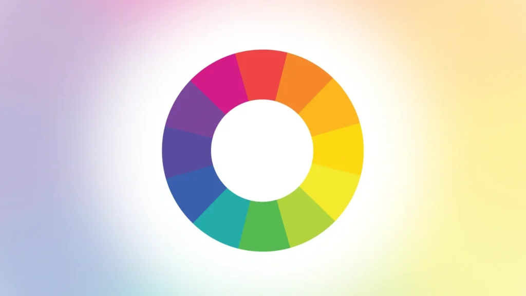
The color wheel is an indispensable tool in color theory. It is a visual representation of the relationships between colors and serves as a guide for creating harmonious combinations. The color wheel consists of circularly arranged primary, secondary, and tertiary colors. Understanding the color wheel allows us to derive various color schemes that provide different visual impacts.
Color Wheel and Color Harmony
The color wheel is divided into color schemes, each offering a distinct aesthetic effect. One of the most commonly used schemes is complementary colors. Complementary colors are pairs opposite each other on the color wheel, such as red and green or blue and orange. These combinations create a vibrant contrast and make each color appear more vibrant when placed together.
Analogous colors, on the other hand, sit next to each other on the color wheel, such as blue and green or orange and yellow. Analogous color schemes create a sense of harmony and cohesion, making them ideal for creating peaceful and balanced designs.
Triadic colors involve selecting three evenly spaced colors around the color wheel. This scheme ensures a strong visual contrast while maintaining a sense of harmony. For example, a triadic color scheme can include yellow, blue, and red.
Split-complementary colors are a variation of complementary colors. Instead of using the direct opposite color, this scheme selects two colors adjacent to the complementary color. This creates a balanced yet dynamic color combination.
Tetradic colors consist of two sets of complementary color pairs. This scheme offers a high level of contrast and variety, making it versatile for visually engaging designs.
By understanding these color schemes derived from the color wheel, designers can create visually appealing compositions and achieve the desired aesthetic effect.
Color Properties and Meanings
To truly master color theory, it’s important to grasp the properties and meanings of colors. The three key properties of color are hue, saturation, and value (HSV). Hue refers to the specific shade of a color, such as red, blue, or green. Saturation determines the intensity or purity of a color, ranging from vibrant and vivid to dull and muted. Value, also known as brightness or lightness, describes the amount of black or white mixed with a color, influencing its overall tone.
Colors profoundly impact human emotions and can evoke robust psychological responses. Warm colors like reds, oranges, and yellows are associated with energy, passion, and excitement. They can create a sense of warmth and urgency. On the other hand, cool colors, including blues, greens, and purples, evoke calmness, tranquility, and harmony. They are often used to create a sense of serenity or introspection.
However, cultural influences can significantly shape the meaning and symbolism of colors. While red may symbolize luck and prosperity in one culture, it may represent danger or warning in another. Understanding cultural variations in color symbolism is essential when designing for a global audience or specific cultural contexts.
Color Contrast and Accessibility
Color contrast is a fundamental principle in design. It is crucial in creating visual appeal, establishing hierarchy, and improving readability. Contrast refers to the difference in luminance or color between two elements.
In design, it’s essential to consider both luminance contrast and color contrast. Luminance contrast relates to the difference in brightness between two colors, while color contrast involves distinguishing between different colors. Using contrasting colors or adjusting the brightness between elements can help create a clear visual distinction and guide the viewer’s attention.
Ensuring accessibility is another crucial aspect of color theory. Accessible design aims to provide inclusivity for all users, including those with visual impairments. The Web Content Accessibility Guidelines (WCAG) provide standards and recommendations for color contrast ratios to ensure legibility for individuals with different visual abilities. Adhering to these guidelines enables a broader audience to engage with your designs.
In addition to following WCAG guidelines, other techniques can enhance accessibility. For example, using alternative text (alt text) for images allows visually impaired users to understand the content. Providing high-contrast options for text and user interface elements also improves accessibility.
Considering color contrast and accessibility creates a more engaging design. It ensures that your work is inclusive and accessible to a broader audience.
Applications of Color Theory
Color theory finds its applications in various fields, each harnessing its power uniquely. Let’s explore how color theory enhances different disciplines:
- Graphic and Web Design: Color theory is a cornerstone of creating visually appealing compositions in graphic and web design. By understanding color harmonies and the psychology of color, designers can craft engaging layouts, establish brand identities, and effectively communicate messages. Colors can evoke specific emotions and influence user behavior, allowing designers to design experiences that resonate with their target audience strategically.
- Interior Design and Architecture: Color theory plays a significant role in interior design and architecture. Choosing the right colors can transform spaces, creating specific moods and atmospheres. Warm colors can make a room feel cozy and inviting, while cool colors can bring a sense of calmness and serenity. Interior designers and architects leverage color theory to create harmonious environments that align with the desired aesthetic and purpose of the space.
- Fashion and Visual Arts: In fashion, color theory is at the heart of the design process. Designers carefully consider color combinations to create visually stunning outfits that convey specific themes or emotions. Colors can symbolize different concepts and influence how individuals perceive clothing. In visual arts, color theory provides a powerful tool for expressing feelings, enhancing storytelling, and creating impactful visual compositions.
By understanding color theory and its applications, professionals in these fields can elevate their work, create meaningful experiences, and leave a lasting impression on their audiences.
Tools and Resources for Color Theory
Exploring color theory is an exciting journey, and numerous tools and resources are available to support your learning and creative endeavors. Here are some valuable resources to deepen your understanding and aid your color exploration:
- Color Palettes and Generators: Online platforms such as Coolors, Adobe Color, and Color Hunt offer various pre-made color palettes and generators. These platforms allow you to experiment with different color combinations, discover harmonious schemes, and even create custom color palettes tailored to your needs.
- Online Resources and Tutorials: Many websites and tutorials are dedicated to color theory, providing in-depth explanations, practical examples, and case studies. Platforms like Smashing Magazine, Creative Bloq, and Medium host many articles and tutorials that delve into various aspects of color theory. They offer valuable insights and practical advice to help you better understand color principles.
- Design Software with Built-in Color Tools: Design software such as Adobe Photoshop, Illustrator, and Affinity Designer includes built-in color tools and functionalities. These tools enable you to create, modify, and analyze color schemes directly within your design projects. By utilizing these features, you can ensure that your designs are visually captivating and harmonious.
Utilizing these tools and resources can enhance your knowledge of color theory, experiment with different color palettes, and infuse your designs with captivating colors.
Final Thoughts
Color theory is an enchanting realm that adds depth, meaning, and visual impact to our designs, environments, and creative expressions. By grasping the basics of color theory, understanding the properties and meanings of colors, and exploring its applications across various disciplines, you can unleash the true potential of colors in your work.
So, let your creativity soar and dive into the world of colors. Experiment with different color combinations, understand the emotions they evoke and create designs that captivate and inspire. With a solid foundation in color theory and the resources at your fingertips, there’s no limit to the magic you can create with colors.
FAQs:
1. How can I choose a suitable color scheme for my brand? Choosing the perfect color scheme for your brand requires careful consideration of your target audience, brand personality, and the emotions you want to evoke. Research your audience’s preferences, study successful brands in your industry, and experiment with different color combinations to find the right fit. As expert color consultant Kate Smith advises, “Colors create an emotional response and can help tell your brand’s story. Choose colors that align with your brand’s values and the emotions you want to evoke in your audience.”
2. Can color theory be applied to black-and-white designs? Absolutely! While color theory primarily focuses on the interaction of different hues, it is equally relevant to black-and-white designs. In the absence of color, contrast, value, and texture become even more critical. By using varying shades of gray, patterns, and textural elements, you can create captivating black-and-white designs that evoke emotion and engage the viewer’s eye.
3. How can I use color theory to create a calming workspace? Choose cool colors such as soft blues, greens, or neutrals like grays and whites to create a calming workspace. These colors have a soothing effect and promote focus and concentration. Incorporate natural elements, such as plants or natural textures, to bring a sense of tranquility to your workspace. As renowned interior designer Kelly Hoppen states, “Using the right colors in a workspace can create an environment that feels peaceful, inspiring, and conducive to productivity.”
4. Are there any cultural considerations when choosing colors for a global audience? Yes, cultural considerations are crucial when selecting colors for a worldwide audience. Colors can hold different meanings and cultural associations across various countries and regions. For example, while white may symbolize purity and innocence in Western cultures, it is associated with mourning in some Eastern cultures. To avoid unintended misunderstandings or offense, research and understand the cultural symbolism of colors in your target regions or consult with local experts when designing for specific cultures.
5. Where can I find color palettes and generators online? There are numerous online platforms where you can see color palettes and generators to inspire your designs. Canva, Adobe Color, and Color Hunt are popular websites that provide a wide range of pre-made color palettes and tools to generate custom color schemes. These platforms offer a wealth of colors to explore and experiment with, making finding the perfect palette for your projects easier.