TLDR
- A unique wedding invitation for the holiday season works best when it feels wedding-first and season-aware, not like a generic Christmas card with your names added later.
- Choose one main seasonal signal, such as color, texture, or motif, then pair it with one personal detail that actually belongs to your relationship or venue.
- Let paper, envelopes, vellum, ribbon, or a wax seal add atmosphere so the design itself can stay clean.
- Keep wording lightly seasonal unless a playful holiday tone genuinely fits you.
- Mail earlier than you think if your date falls near a major holiday, and test one fully assembled suite before buying postage for the whole batch.
A unique wedding invitation for the holiday season usually does not come from adding more holiday elements. It usually comes from choosing the right ones. One strong palette, one thoughtful seasonal cue, and one personal detail will take you much further than snowflakes, ornaments, holly, plaid, script fonts, and gold glitter all trying to win the same argument.
That matters even more if your wedding lands near Thanksgiving, Christmas, Hanukkah, or New Year’s. Your invitation is arriving during one of the busiest stretches of the year, when people are sorting through family cards, gift deliveries, party invites, travel plans, and work obligations all at once. The piece needs to feel distinct, clear, and unmistakably like your wedding.
Decide How Holiday You Want It to Feel
Before you pick colors or paper, decide where your invitation should sit on the holiday spectrum.
The first option is winter-inspired. This is the safest lane if you want something timeless. Think deep blue, evergreen, ivory, silver, warm candlelight, snowy venue illustrations, velvet ribbon, or subtle botanical details. It feels seasonal without attaching itself too tightly to one specific holiday.
The second option is holiday-adjacent. This is where you start leaning into the season more clearly, with details like garlands, rich berry tones, warm metallics, stars, or a slightly more festive suite assembly. This can feel especially good for December weddings that want warmth and celebration without turning into themed stationery.
The third option is fully festive. This works for some couples, especially if the wedding itself is intentionally Christmas-forward or New Year’s Eve inspired. But it needs more restraint than people think. Once you add obvious holiday imagery, the line between wedding invitation and seasonal party card gets very thin.
If you are unsure, stay one step more restrained than your first instinct. Holiday design gets loud very quickly.
Build the Design Around One Seasonal Cue
The easiest way to make a holiday invitation feel special is to let one seasonal cue do most of the work.
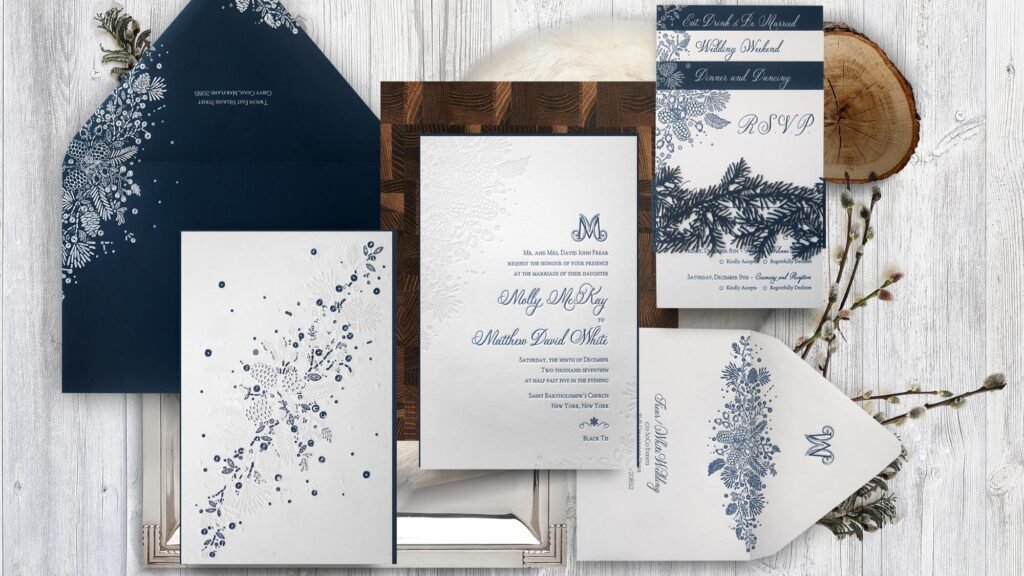
That cue might be color. Instead of bright primary red and green, try more grown-up versions of the same idea. Forest green with cream and copper feels warm and classic. Cranberry with blush and gold feels softer and more romantic. Navy, white, and silver feels crisp and wintery. Black, ivory, and champagne works beautifully for evening weddings and New Year’s celebrations.
It might be illustration. A sketched venue in snow, winter branches, stars, candlelight, or a subtle wreath can carry the seasonal tone without crowding the page. This is especially effective if the rest of the layout is clean and typography-led.
Or it might be texture. Velvet ribbon, a vellum wrap, a soft translucent overlay, a wax seal, or a warm-toned envelope liner can make a suite feel seasonal before the guest even reads the first line.
What you want to avoid is stacking three or four loud seasonal ideas on top of each other. If you already have rich color, skip the busy motif. If you already have a bold envelope liner, keep the main card calmer. Good stationery often feels edited. That is not very glamorous advice, but it is reliable.
Make It Personal, Not Just Seasonal
The most memorable holiday wedding invitations are not memorable because they are holiday invitations. They are memorable because they belong to the couple.
That personal detail might be your venue. A ski lodge, church, estate, greenhouse, mountain resort, city hotel, or family home can shape the entire look of the suite.
It might be a visual theme that connects to your story. Maybe you got engaged under string lights, spend every December in the mountains, host an annual holiday dinner, or love old-world typography and formal black-tie details. Those cues are more interesting than generic candy canes and much more likely to age well.
It might even be the mood of the event. A candlelit evening wedding wants different stationery than a cheerful brunch reception in early December. A cozy family gathering wants something different from a formal ballroom celebration. Start there. The invitation should sound and look like the event guests are about to attend.
A good rule is this: if you remove the seasonal cues, the invitation should still feel like you.
Let Paper and Assembly Carry Some of the Style
This is where people often make the smartest improvement.
If you want your invitation to feel more distinctive, you do not always need a busier design. Sometimes you just need a better physical presentation. Heavier stock, a warm uncoated finish, a vellum jacket, an envelope liner, a belly band, or a ribbon can create a much more considered result than adding another decorative graphic.
This is also why paper choice matters more than it gets credit for. A minimal winter invitation can look flat on the wrong stock and beautifully composed on the right one. If you want help thinking through that side of the decision, Printiverse already has a strong guide on how to pick the right paper for wedding invitations.
And if finish or texture is doing a lot of the work, do not rely only on a screen. Printiverse’s proofing guidance makes an important distinction here: a digital proof is best for checking text, layout, sizing, and setup, while a physical proof is better when you need to judge the in-hand feel of paper, finish, or presentation. That is especially useful for darker palettes, metallic effects, and layered suites, where the real-life result matters more than the mockup.
Keep the Wording Seasonal, but Light
Wording is another place where restraint usually wins.
You do not need to turn the whole invitation into a holiday pun. In fact, the most elegant holiday wedding invitations usually sound like wedding invitations first, with just a slight seasonal note.
A few examples:
“Please join us for a winter wedding celebration.”
“With joy, we invite you to celebrate our marriage this holiday season.”
“Join us for an evening of dinner, dancing, and a candlelit celebration.”
“Celebrate with us as we marry at the close of the year.”
Those lines still feel event-appropriate. They simply place the invitation in a season.
If your tone is more playful, you can go a little further. But I would still be careful. “Meet us under the mistletoe” can be charming in the right setting. A full page of novelty Christmas phrasing can make the piece feel less like a keepsake and more like a themed flyer.
This is one of those cases where the invitation does not need to prove the theme. It just needs to suggest it.
Plan for Real-World Mailing, Not Just Photos
Holiday wedding invitations have two practical challenges: timing and mailability.
Timing first. Emily Post recommends mailing wedding invitations six to eight weeks before the wedding, with save the dates going out earlier when needed. That earlier notice becomes more valuable when your date falls during a busy travel season or holiday weekend, because guests may be locking in flights, family plans, or time off sooner than usual.
Then there is the mail itself. USPS says letter-priced envelopes need to stay rectangular and within certain size and thickness rules, and it notes that rigid, lumpy, square, or unusually shaped envelopes can require extra postage or nonmachinable handling. In plain English, the pretty extras can change the postage math. Wax seals, square envelopes, heavy layering, clasps, string, or bulky inserts can all create mailing issues if you do not test them first.
And because USPS explicitly treats the holidays as a peak season with higher mail volume, it is smart to build extra margin into your mailing plan if your invitations are going out in late November or December. Holiday mail can humble a very pretty invitation.
The simplest move is to assemble one full suite, take it to the post office, and ask them to weigh and review it before you stamp everything else. That small errand can save you a very annoying batch problem.
A Simple Formula You Can Steal
If you want a clean starting point, use this formula:
Choose one seasonal cue.
Choose one personal detail.
Choose one tactile upgrade.
Keep the wording mostly classic.
Test the finished suite before mailing.
For example, that might look like this:
- Seasonal cue: forest green and warm gold
- Personal detail: an illustration of your snowy venue
- Tactile upgrade: vellum wrap with a wax seal
- Wording: classic invitation text with one light seasonal line
- Practical check: one assembled suite tested for postage
That is enough. Truly. Most invitations become more interesting when they get more specific, not more decorated.
Why Printiverse Is a Good Fit for This Kind of Invitation
Holiday wedding suites usually involve more moving parts than people expect. You are not just choosing a design. You are balancing color, paper, timing, assembly, and proofing.
That is where Printiverse is a good fit. Their custom invitation workflow lets couples start with a template, upload finished artwork, or work with the team on something more custom, and the platform includes a digital proofing step before production. If you want extra confidence on paper feel or finish, Printiverse also offers physical proofs and sample packs on supported orders. That makes it easier to create something that feels distinctive without guessing your way through the final print result.
A holiday invitation should feel thoughtful, not overloaded. If you get the balance right, the season adds atmosphere. It does not take over the whole design.
FAQs
Should a Holiday Wedding Invitation Look Christmas-Themed?
Only if you want it to. Many of the best holiday wedding invitations are simply winter-toned, candlelit, or subtly festive. You do not need overt Christmas imagery for the suite to feel seasonal.
When Should I Mail Holiday Wedding Invitations?
For most weddings, six to eight weeks before the date is the standard guideline. If the wedding falls during a busy travel season or holiday weekend, earlier save the dates are especially helpful.
Are Wax Seals Okay for Mailed Invitations?
Often yes, but they can affect postage and processing. USPS says rigid, lumpy, square, or unusually shaped envelopes may require extra postage or nonmachinable handling, so it is best to test one finished suite first.
Should I Use Red and Green?
You can, but deeper and more restrained versions usually feel more elegant. Think forest, cranberry, burgundy, or olive instead of bright holiday-store shades.
Is a Physical Proof Worth It for a Holiday Suite?
Usually yes, if paper feel, dark color, metallic effects, or layered assembly matter to the final look. A digital proof is useful for layout and text, but it cannot fully show how a finished invitation will feel in person.