If you’ve ever held a “perfect” label up to a jar and realized it’s somehow both too big and too small, welcome to the club. Sticker sizing looks simple until you’re staring at a curved bottle, a textured kraft bag, or a tiny QR code that refuses to scan.
This sticker size guide for small businesses is meant to fix that. I’m going to walk through the sizes that tend to work over and over for logo stickers, packaging labels, and QR code stickers—especially for jars, bags, boxes, and giveaways. I’ll also call out the mistakes that cause reprints, wasted rolls, and that annoying “why does this look off?” feeling.
How to choose the right sticker size (without overthinking it)
Sticker size is really three decisions rolled into one:
1) Where does it go?
Flat surfaces (box tops) forgive more than curved or tapered ones (bottles, jars, tins). Curves shrink your usable “label panel” fast, especially near shoulders and seams.
2) What’s the job?
A logo sticker usually needs instant recognition. A product label needs readability. A QR code label needs scannability and breathing room.
3) How far away will someone read it?
Giveaways get viewed at arm’s length or closer. Shipping labels get scanned. Shelf products get glanced at from a couple feet away.
Here’s the single best move you can make before placing a big order: print a paper test at actual size, cut it out, and stick it on the real container. It feels basic, but it catches 90% of sizing mistakes before they cost money.
The short list: go-to sticker sizes for logos and giveaways
If you just want “safe” sizes that work for a lot of brands, start here:
1″ round (tiny but mighty)
This is your “seal” size. Great for:
- closing tissue paper
- thank-you seals on envelopes
- small logo marks on packaging
- price dots or batch/date stickers
It’s small enough that detailed text often looks cramped. If you need a tagline or URL, you’ll usually be happier bumping up.
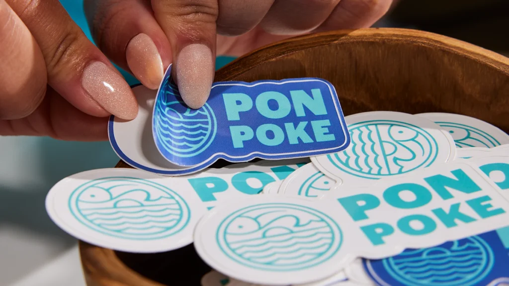
1.5″–2″ round (the everyday logo sticker)
If small businesses had a default logo sticker, this is it. It’s big enough for a logo mark plus a short brand name. It looks clean on:
- poly mailers
- coffee bags
- boxes
- product wrap
- small jars (front label style)
This range is also a good “starter” for sticker handouts at markets because it’s easy to peel and doesn’t feel tiny.
3″ round or 3″ die cut (the giveaway winner)
If you want a sticker that people actually put on a water bottle or laptop, 3 inches is a sweet spot. It feels like a real sticker, not an afterthought. It also gives your artwork room to breathe.
3.5″ x 2″ rectangle (business-card vibe)
This size has a familiar feel and works well when you want text:
- “how to use” instructions
- ingredients (short lists)
- a tagline + URL
- promo codes
It’s also a strong choice for packaging inserts when you want the sticker to act like a mini card.
Quick cheat sheet
| Use case | Good starting size | Why it works |
|---|---|---|
| Tiny seals / tissue closure | 1″ round | Fast, clean, cheap coverage |
| Standard logo stickers | 1.5″–2″ round | Fits most logos without crowding |
| Giveaways that feel premium | 3″ round / ~3″ die cut | Looks intentional on bottles/laptops |
| Info-heavy branding label | 3.5″ x 2″ | Room for readable text |
Packaging labels for jars, bottles, and tins (measure the “label panel” first)
Jars and bottles are where people most often guess—and guessing is how you end up with labels that wrinkle, lift, or land on a curve.
For round bottles and jars: width is circumference (minus a gap)
If you’re doing a wrap-style label, you’re working with the container’s circumference. Measure around the label area with a flexible tape (or even a strip of paper you mark and measure). Then decide whether you want:
- a small gap between label ends (easier to apply neatly), or
- an overlap (common for some applications, but harder to align cleanly by hand)
A practical rule is to subtract about 1/8″ to 1/4″ from the measured width so you aren’t fighting perfect alignment when applying labels manually.
Height matters more than people think
The top “shoulder” curve is where labels start to lift or wrinkle. Your label height should stay on the flattest part of the surface. If your label is too tall, it might look fine in your design file, then immediately look crooked once applied.
Common “front label” sizes that tend to fit jars well
You can absolutely do custom sizing, but these ranges come up constantly because they fit a lot of real containers:
- About 3″ x 2″: common for many small straight-sided jars (think candles, cosmetics, pantry items).
- About 3.5″ x 2″: a little more breathing room for product name + scent/flavor + net weight.
- Oval 2″ x 3″: often nicer than a circle when your brand name is longer.
If your jar is tapered (wider at the base than the top), be extra cautious. Tapered containers reduce your usable label panel and can cause “flagging” at the edges.
Don’t forget lids and bottoms
If you sell a jarred product, lid stickers are underrated. They add branding when products are stacked or viewed from above. A common approach is:
- a round lid sticker (often 2″–2.5″ depending on lid size)
- plus a front rectangle/oval label for product info
Box and bag labels: sizes that look intentional on packaging
Bags and boxes are usually easier than bottles, but there’s a different trap: choosing a size that technically fits but visually looks “lost” or “crowded.”
For small retail boxes (soap, candles, small goods)
A lot of brands do well with:
- 2″ round for logo sealing or top branding
- 3″ x 2″ or 3.5″ x 2″ for a front panel with name + scent/flavor + small details
If your box has a busy design, smaller stickers can look like an afterthought. If the sticker is the design, size up.
For kraft bags, coffee bags, and stand-up pouches
These often look best with a bit more height than you expect because the surface is tall and narrow:
- 2″ x 3″ or 3″ x 4″ rectangles are common “hero label” sizes
- oval 2″ x 3″ can feel more premium and is forgiving on slightly curved surfaces
Also, textured paper bags can make tiny text hard to read. If you need fine print, give it space.
For shipping boxes and mailers
Two different “labels” live here:
- Branding sticker: usually 2″ round or 3″ round on the box top or tissue paper.
- Shipping label: typically 4″ x 6″ (the standard most carriers and label printers are built around).
If you’re printing shipping labels, verify what your workflow expects before you order a thousand labels in a size your printer hates.
QR code stickers: size, quiet zone, and “why won’t this scan?”
QR code stickers fail for two reasons: they’re too small for the distance, or they’re surrounded by design clutter.
Minimum size is not the same as “works every time”
You’ll see technical minimums as low as around 10 mm / 0.4″ (not counting the quiet zone). In real life—on real packaging, with glare, smudges, and normal phone cameras—most businesses have better results starting around 0.8″ x 0.8″ (2 x 2 cm) for close-up scanning and going bigger as distance increases.
A few practical starting points:
- Handheld labels/inserts: ~1.0″–1.25″
- Bottles/jars at arm’s length: ~1.25″–1.75″
- Counters/signage: 1.5″–2.0″ and up
Quiet zone: you need a clean border
QR codes require a blank margin around them (quiet zone). The standard rule is at least four “modules” wide on every side (modules are the tiny squares that make up the code). If you put background patterns, borders, or textures into that margin, scanning gets flaky fast.
Keep it high contrast
Dark code on a light background is the safe choice. Avoid “inverted” codes (light on dark) and avoid gradients or textures behind the code.
Test like a customer
Before you commit:
- print one at actual size
- stick it on the real surface
- scan it with at least two phones in the lighting where it will live
If it feels finicky, the fix is usually boring: make it bigger and simplify the background.
Print setup rules that save you from reprints
This is where sizing and design overlap. If you ignore these, even the “right” sticker size can look bad.
Keep small text realistic.
For most labels, 8 pt is a common minimum recommendation for readable print text. You can sometimes push smaller, but it gets risky depending on font weight and material.
Don’t use hairline strokes.
Very thin lines can disappear or break up in print. A safer floor for fine strokes is around 0.25 pt.
Use bleed and a safe zone.
If your design goes to the edge, you want bleed so tiny cutting shifts don’t show a white halo. A common bleed is 0.125″ (3 mm), and keeping important elements inside a safety margin helps avoid “almost cut off” text.
Where people usually mess up (and how to avoid it)
Let me call out the repeat offenders.
Mistake 1: Picking a size before knowing the content.
If you need ingredients, usage instructions, net weight, and a barcode… a 2″ circle is going to feel like a punishment. Start with what must be readable, then choose the size.
Mistake 2: Ignoring the container’s curves.
Labels placed too high on a shoulder curve wrinkle. Labels on tapered containers lift at edges. Measure the actual label panel, not the “overall bottle height.”
Mistake 3: Designing right to the edge without bleed.
That “thin white border” that shows up after cutting is almost always a bleed/safe-area issue, not a printer issue.
Mistake 4: Making QR codes tiny to “keep it clean.”
A QR code that doesn’t scan is worse than no QR code. Keep the quiet zone clean, size it for the distance, and test.
Mistake 5: Trying to cram a long brand name into a circle.
If your brand name is long, consider an oval or rectangle. Circles are great for icons and short names. They’re annoying for long words.
Conclusion: pick a starting size, then prove it in the real world
If you want a clean starting point, most small businesses can cover 80% of needs with:
- 2″ round logo stickers
- 3″ round / ~3″ die cut giveaways
- 3″ x 2″ or 3.5″ x 2″ for front labels with readable text
- 1″–1.75″ QR code stickers depending on distance (bigger if you can)
Then do the unglamorous step that saves you money: print a test, stick it on the real surface, and live with it for five minutes. You’ll know fast if it feels right.