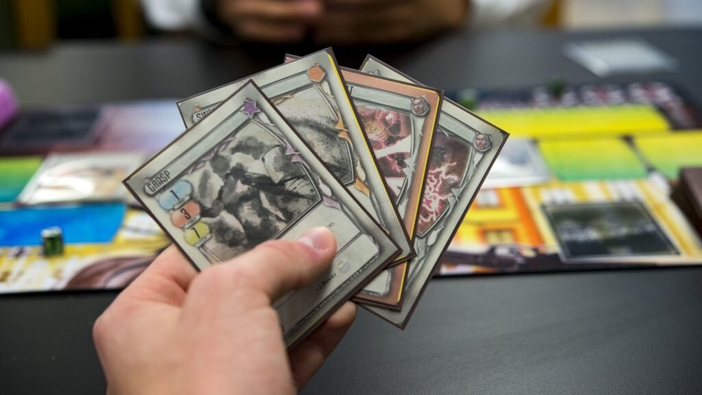
Trading cards are small, but they punish small mistakes. One tiny slip in sizing and you get that classic result: a thin white edge, text that looks “too close,” or a border that’s thicker on one side than the other. The good news is that most of this comes down to a few simple specs: trading card size, bleed, and safe zone.
This guide covers the standard 2.5 x 3.5 card, the common oversized options, and how to approach custom sizes. I’ll also give you a quick cheat sheet you can keep nearby and a clear answer to the “what do I export?” question: PDF vs PNG.
The standard trading card size: 2.5 x 3.5 (and the two “standards” you’ll see)
When people say “standard trading card size,” they usually mean a poker-sized card. In the U.S., that’s commonly 2.5″ x 3.5″ (63.5 x 88.9 mm). This is the size most people recognize from playing cards and many custom TCG prints.
You’ll also see a very close sibling size used by some printers and templates: 63 x 88 mm, which is roughly 2.48″ x 3.46″. In day-to-day use, they feel basically the same in your hand, but the difference can matter if you’re trying to match an existing deck exactly or you’re picky about how cards fit in sleeves.
If you’re printing a deck meant to “feel” like mainstream trading cards, the safe move is this:
- Start with 2.5 x 3.5 if your printer calls it “traditional poker size” or if you’re matching a lot of U.S. playing card specs.
- Start with 63 x 88 mm if your printer calls it “poker size” or “standard size” in metric terms.
And regardless of which you choose, the real key is the next part: you’re not designing only for the trimmed size. You’re designing for trim + bleed + safe zone.
Quick cheat sheet: sizes, bleed, and safe zone
Here’s the cheat sheet you asked for. Think of it like three rectangles stacked on top of each other:
- Trim size = the final card size in your hand
- Bleed = extra image that gets cut off (prevents white slivers)
- Safe zone = “don’t put important stuff here” margin inside the trim
Most printers will tell you their exact numbers. If they don’t, a common baseline is 1/8″ (0.125″) bleed and at least 1/8″ safe zone. Some recommend more safe space, especially if you’re using borders.
Common card sizes (starting points)
| Card type | Trim size (in) | Trim size (mm) | Suggested bleed | Suggested safe zone |
|---|---|---|---|---|
| Standard / Traditional poker / TCG | 2.5 x 3.5 | 63.5 x 88.9 | 0.125″ (3mm) each side | 0.125″–0.25″ (3–6mm) inside |
| “Standard poker” (common template) | 2.48 x 3.46 | 63 x 88 | 3mm each side | 3–6mm inside |
| Bridge | 2.25 x 3.5 | 57 x 89 | 0.125″ (3mm) each side | 0.125″–0.25″ inside |
| Mini | 1.75 x 2.5 | 44.5 x 63.5 | 0.125″ (3mm) each side | 0.125″–0.25″ inside |
| Tarot (oversized) | 2.75 x 4.75 | 70 x 120 | 0.125″ (3mm) each side | 0.125″–0.25″ inside |
| Large (big oversized deck) | 3.5 x 5.75 | 89 x 146 | 0.125″ (3mm) each side | 0.125″–0.25″ inside |
How to use this table without getting burned: always check your printer’s template first. Some printers label sizes differently (especially “poker” vs “traditional poker”), and some will want a slightly different bleed box.
What this looks like for 2.5 x 3.5
If you’re working with 2.5 x 3.5 and using 1/8″ bleed:
- Trim: 2.5 x 3.5
- Full-bleed art size: 2.75 x 3.75 (you add 0.125″ on every side)
- Safe zone (minimum): keep text/icons at least 0.125″ inside the trim
- Safe zone (safer for borders): 0.25″ inside the trim
That’s the core logic you’ll reuse for any card size.
Bleed and safe zone: why they matter (and why borders cause drama)
Bleed prevents the “white hairline” problem
Printers cut stacks of cards, not single cards one at a time with perfect precision. There is always some movement and tolerance. That’s normal. Bleed is your insurance policy.
If your background color or artwork goes right to the edge, you extend it past the trim line into the bleed area. When the card is cut, you still get edge-to-edge ink.
Safe zone protects your text and icons
The safe zone is the opposite of bleed. Instead of extending outward, it pulls your important elements inward.
Card corners get rounded. Cut lines drift a bit. And if you place a mana symbol, a number, or a logo too close to the edge, it can look cramped even if it doesn’t get cut off.
A simple rule: if it would hurt to lose it, keep it inside the safe zone.
Borders exaggerate every tiny cutting shift
This is the big one. A thin frame or a “perfectly even” border looks great in a design file and then looks off in print because cutting drift makes one side slightly thicker.
If you want borders anyway, you can still do it. You just need to design like a printer:
- Make borders thicker than you think they need to be (thin borders show errors).
- Avoid hairline strokes for frames.
- Consider using full-bleed art with no border on the front, and save borders for places where you can tolerate variance.
- Keep critical elements farther inside the safe zone when borders are present.
A lot of people learn this the hard way. If you want fewer reprints, this is the spot to be conservative.
Oversized cards: tarot, large formats, and when they’re worth it
Oversized cards are popular for three reasons:
- More art presence. Bigger cards let your illustration breathe.
- More readable text. Great for complex rules text, reminders, or reference cards.
- Premium feel. Oversized cards feel like a “special” item in a set.
The most common oversized step up is tarot size: 2.75 x 4.75. It’s large enough to feel different, but still comfortable to hold and shuffle (depending on stock and finish).
Then you get into even larger formats like 3.5 x 5.75, which are great for promos, oversize commanders, character cards, or display-friendly products. They’re less “shufflable,” but they can look amazing.
A few practical oversize notes:
- Sleeves and storage change. Standard trading card sleeves won’t fit tarot or large sizes. If your buyers expect sleeves, mention this.
- Back design becomes more noticeable. Bigger cards show alignment issues more clearly. Go full bleed and avoid thin frames on the back if you can.
- Corner rounding still matters. Bigger cards have more corner area, so keep important elements away from corners.
Custom sizes: how to choose without creating production headaches
Custom sizes are totally doable. But you want a reason. Otherwise you’re trading convenience for complexity.
Good reasons to go custom:
- You need a size that fits a specific box, insert tray, or packaging system.
- You want a unique “feel” (square cards, mini cards, long cards).
- You’re matching an existing product spec exactly.
Production-friendly advice for custom sizes:
1) Stay close to common aspect ratios when you can.
If your design is a 2.5 x 3.5 layout and you go wildly different, you’ll spend more time redesigning frames, text boxes, and icon positions than you expect.
2) Confirm corner rounding.
Most cards are rounded by default. If your concept needs square corners, make sure your printer can do it (and note that square corners change how wear shows over time).
3) Decide early if the cards must fit standard sleeves.
This one decision can save you a lot of back-and-forth later. If you want sleeve compatibility, stick close to standard TCG sizes and tolerances.
4) Don’t reinvent bleed and safe zone.
Even for custom sizes, the same print logic applies. Add bleed. Keep important stuff inside a safe zone. Avoid thin borders that must be perfectly symmetrical.
What to export: PDF vs PNG (and what settings actually matter)
This is where a lot of people get stuck. They ask, “Should I send a PDF or PNG?” The honest answer is: both can work, but they solve different problems.
Use PDF when…
You have text, vector elements, or multiple cards in a set, and you want clean edges and predictable layout.
PDF is great because:
- Text can stay crisp (vector) instead of being baked into pixels.
- You can include multiple pages (one per card) in a single file.
- It’s easier to include bleed properly if you’re using InDesign/Illustrator.
PDF export tips (general best practices):
- Export at press quality (or equivalent).
- Make sure bleed is included if your design goes to the edge.
- Avoid downsampling below 300 dpi for raster art.
- Embed fonts or outline them (printers vary; outlining prevents font substitution, but you lose editability).
- Only include crop marks if your printer specifically wants them.
Use PNG when…
You’re exporting single card faces as images (often one file per card front/back) and your workflow or printer accepts image uploads.
PNG is great because:
- It’s lossless, so you don’t get JPEG artifacts around text or line art.
- It’s simple: one image = one card face.
PNG export tips:
- Export at 300 dpi (or export at pixel dimensions that equal 300 dpi at your final size).
- Export at the full-bleed size, not the trim size, unless your printer says otherwise.
- Keep edges clean. Avoid adding your own crop marks unless requested.
- Use RGB or CMYK based on what your printer asks for. Many accept RGB and convert, but conversions can shift colors.
The “one sentence” rule
If your card has lots of text and vector shapes, PDF is usually safer.
If your cards are mostly artwork and you’re delivering one file per card, PNG is usually easier.
And yes, some printers accept both and don’t care. But the second you hit a problem—missing bleed, soft text, or color shifts—PDF tends to be easier to troubleshoot.
A quick preflight checklist before you send files
Before you upload anything, do this quick sanity pass:
- Open your file and confirm the trim size is correct (2.5 x 3.5 or your chosen spec).
- Confirm you have bleed on any edge-to-edge backgrounds.
- Check your safe zone: text/icons aren’t hugging edges or corners.
- If you have borders, ask yourself: “Will I be mad if this border is slightly uneven?” If yes, redesign now.
- Export one test card and zoom in to 200–300%. Make sure text is sharp and line art isn’t breaking up.
That’s it. If those five things are correct, your print results get dramatically more consistent.
Conclusion
Most trading card projects go sideways for the same reason: people design only for the final 2.5 x 3.5 trim, then forget that printing needs room to breathe. Bleed prevents white edges. Safe zone prevents cramped layouts and accidental trimming. And borders, while tempting, make every tiny tolerance look bigger than it is.
If you keep those rules in mind, you can print standard decks, oversized tarot-style cards, or totally custom formats with way fewer surprises. And when you’re exporting, pick the format that matches your content: PDF for crisp text and multi-page sets, PNG for simple per-card image workflows.