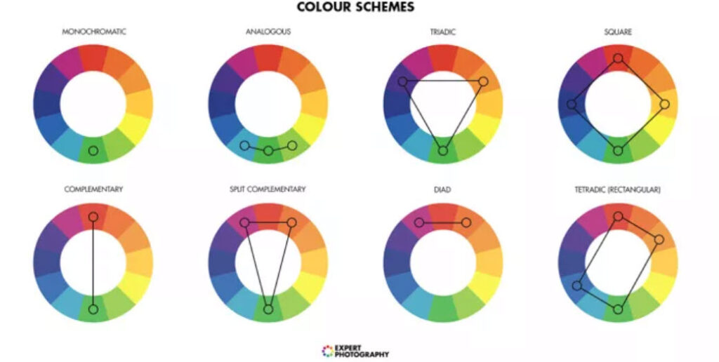
Complementary colors play a crucial role in art, design, and visual communication, creating striking contrasts and vibrant aesthetics. On a color wheel, complementary colors are hues that are opposite each other, creating dynamic visual effects when paired together. But how are these complementary colors calculated? Let’s delve into the science and artistic principles behind this fascinating aspect of color theory.
Understanding the Basics of the Color Wheel
The color wheel is a circular representation of colors organized based on their chromatic relationships. First conceptualized by Sir Isaac Newton in the 17th century, the modern color wheel comprises primary, secondary, and tertiary colors.
- Primary Colors: Red, blue, and yellow form the foundation. These colors cannot be created by mixing other hues.
- Secondary Colors: Green, orange, and purple are formed by mixing two primary colors:
- Red + Yellow = Orange
- Yellow + Blue = Green
- Blue + Red = Purple
- Tertiary Colors: These result from mixing primary and secondary colors, creating hues like red-orange, yellow-green, or blue-violet.
What Are Complementary Colors?
Complementary colors are pairs of hues positioned directly opposite each other on the color wheel. When placed side by side, they enhance each other’s intensity and create a visually arresting contrast. For example:
- Red and green
- Blue and orange
- Yellow and purple
The oppositional placement stems from the way colors interact visually and psychologically. Complementary colors balance each other, offering dynamic contrasts that are both pleasing and dramatic.

The Science Behind Complementary Colors
To understand how complementary colors are calculated, we must explore the science of color perception. Human vision relies on cone cells in the retina, which are sensitive to three primary wavelengths of light: red, green, and blue. The perception of complementary colors arises from the way these wavelengths interact.
- When one color stimulates specific cone cells, its complementary color inhibits those same cells, creating a sense of balance.
- For example, red light activates long-wavelength-sensitive cones, while its complement, green, activates medium-wavelength-sensitive cones.
This interplay between stimulation and inhibition creates the vivid contrast characteristic of complementary colors.
How Complementary Colors Are Determined on a Color Wheel
1. Using Additive and Subtractive Color Models
The calculation of complementary colors depends on the color model used:
- Additive Color Model (RGB): Used in digital screens and light-based systems, the primary colors are red, green, and blue. Complementary pairs are derived by subtracting a color from white (the sum of all colors in the additive model):
- Red’s complement: Cyan (green + blue)
- Green’s complement: Magenta (red + blue)
- Blue’s complement: Yellow (red + green)
- Subtractive Color Model (RYB): Common in traditional painting and printing, the primary colors are red, yellow, and blue. Complementary colors are determined by subtracting one color from the primary palette:
- Red’s complement: Green
- Blue’s complement: Orange
- Yellow’s complement: Purple
2. Position on the Color Wheel
In practical terms, complementary colors are selected by drawing a straight line through the center of the color wheel to find the hue on the opposite side. For example:
- Red is directly opposite green.
- Blue is directly opposite orange.
- Yellow is directly opposite purple.
This method works consistently across color wheels designed for different applications.
3. Color Harmony Rules
Color harmony involves combining hues in ways that are visually appealing. Complementary color pairs create one of the most striking harmonies because of their high contrast. Designers and artists use this pairing to evoke excitement or direct attention to specific elements.
Applications of Complementary Colors
Art and Design
In painting and graphic design, complementary colors enhance compositions by:
- Creating contrast: A blue sky juxtaposed with an orange sunset creates a dramatic effect.
- Adding balance: Combining complementary colors in a scene ensures a visually harmonious composition.
- Highlighting focal points: Artists often use complementary colors to draw attention to specific elements.
Interior Design
Interior designers leverage complementary colors to create bold statements. For example:
- A red sofa in a green room creates an energetic vibe.
- Blue walls paired with orange accents evoke warmth and tranquility.
Fashion
In fashion, complementary colors help create outfits that pop. A yellow scarf against a purple jacket or a green dress paired with red shoes draws the eye and creates memorable ensembles.
Marketing and Branding
Marketers use complementary colors to grab attention and influence consumer behavior. For example, logos or advertisements may pair blue with orange or yellow with purple to create a lasting impression.
Common Challenges with Complementary Colors
While complementary colors offer striking effects, they must be used thoughtfully to avoid clashing or overwhelming the viewer. The high contrast can sometimes feel too intense if not balanced with neutral tones or variations in saturation.
For instance:
- High-saturation complements: Pairing bright red and green can feel overly aggressive.
- Toned-down complements: Using softer shades or tints, like sage green and dusty pink, creates a more subtle effect.
Tips for Effectively Using Complementary Colors
- Adjust Saturation and Brightness: Use muted tones or pastel variations for a softer aesthetic.
- Incorporate Neutrals: Add whites, grays, or blacks to balance intense contrasts.
- Consider Cultural Contexts: Colors carry cultural meanings that may affect their reception.
- Experiment with Proportions: Use one color as the dominant hue and its complement as an accent.
Wrapping Up
The calculation of complementary colors on a color wheel combines scientific principles, artistic intuition, and mathematical symmetry. By understanding how these oppositional pairs are derived, artists, designers, and creatives can harness their power to craft visually stunning works. Whether in art, fashion, interior design, or marketing, complementary colors provide a timeless tool for creating contrast, balance, and harmony.


