
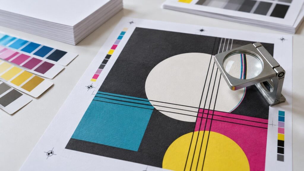
TLDR
Registration tolerance is the acceptable amount of positional variation between elements that are supposed to align. It can apply to one ink color relative to another, the front relative to the back, or printed artwork relative to a cut, fold, score or die line. There is no responsible universal tolerance for every job: the acceptable range depends on the process, material, artwork, finishing sequence and agreed specification.
If you are asking what is registration tolerance printing, the practical answer is that it defines how far production can vary before alignment is considered unacceptable. A tiny shift may disappear inside a photograph yet create a conspicuous white sliver beside a dark border. Good artwork does not assume perfect mechanical alignment; it uses bleed, trapping and adequate clearance according to the kind of movement involved.
Registration, tolerance and misregistration
Registration is the positional relationship between production elements. Registration tolerance is the permitted variation in that relationship. Misregistration is the observed displacement, while “out of register” usually means the displacement exceeds the applicable requirement or is visibly objectionable.
Tolerance matters because printing is not a single abstract action. A multicolor piece may pass through several imaging or printing units. The substrate then may be turned, transported, trimmed, folded, scored or die cut. Each action has its own reference points and sources of variation. The finished piece reflects the combined workflow, not just the accuracy of one press component.
| Alignment type | What must align | Typical visible symptom |
|---|---|---|
| Color-to-color | One printed color separation with another | Colored fringes, white slivers or multicolor text that appears soft |
| Front-to-back | Artwork on opposite sides of a sheet | Back-side content that does not sit as intended relative to front-side edges or folds |
| Print-to-cut | Printed artwork and the final trim or contour cut | Uneven borders or artwork sitting off-center in the finished shape |
| Print-to-finishing | Artwork and a fold, score, perforation, emboss or die-cut feature | A fold crossing content or a finishing feature missing its intended printed position |
Why registration changes during production
Paper, film and other substrates are physical materials. They can move as they travel through equipment, and their behavior can change with tension, moisture, heat, handling and repeated processing. Press setup, mechanical condition, sheet or web transport and the way a later finishing machine establishes its position also affect alignment.
This is why exact alignment cannot simply be assumed throughout an entire run. Adobe’s technical explanation of trapping notes that paper movement and mechanical tolerances prevent exact alignment from being maintained perfectly, which is why small overlaps may be built into adjacent colors. Adobe’s overview of ink trapping explains the prepress principle in more detail.
Different technologies also require different control frameworks. ISO 12647-6:2020, for example, addresses process control for flexographic production printing and includes recommended tolerances for critical process parameters. It is a process-specific standard, not a single registration number that can be assigned to offset, flexography, digital printing and every finishing operation. See the ISO 12647-6 specification overview.
What out-of-register printing looks like
The most familiar symptom is a colored fringe around an object that should have a clean edge. If cyan, magenta, yellow and black components do not land in the intended relationship, fine details can look blurred even though each separation was imaged sharply. Small reverse type built from multiple colors may develop colored edges or partially close up.
A gap can be equally revealing. Two abutting color areas may separate enough to expose an unprinted sliver of substrate. Because that sliver often contrasts strongly with both colors, a very small movement can attract more attention than a larger shift inside a photograph or textured background.
Finishing misalignment looks different. A narrow border may become visibly heavier on one side after trimming. A contour cut may leave an uneven halo around a sticker. A score or fold can move away from the visual hinge in the design. These are print-to-finishing issues rather than color-to-color register problems, even if buyers informally call all of them registration errors.
How operators monitor registration
Registration marks and other control elements give operators measurable references outside or alongside the live artwork. During setup, the production team brings those references into the required relationship. Inspection continues during the run because an acceptable first sheet or initial section of a web does not prove that the condition will remain stable.
The exact control method depends on the equipment. It may involve visual inspection, magnification, cameras, measurement systems or automated press controls. Heidelberg, for example, states that its Prinect Inpress Control system can measure and control color and register inline. That is a capability of specified Heidelberg configurations, not evidence that every press uses equivalent automation.
Stable targets and repeatable measurement are broader process-control principles. G7 materials discuss maintaining repeatable print conditions, but G7 is primarily color and print-condition context; it should not be treated as a universal registration-tolerance specification. Positional alignment is also distinct from the colorimetric questions covered in this practical guide to LAB color in printing.
Trapping helps with minor color movement
Trapping deliberately creates a small overlap between adjacent colors. If the colors move slightly relative to each other, the overlap reduces the chance that bare substrate will appear between them. The trap should be sufficient to conceal expected variation without creating an obvious dark seam or changing the appearance of fine details.
Trapping is not a repair for substantial press movement, and it does not solve print-to-cut or front-to-back alignment. It is a prepress allowance for a particular failure mode: a visible gap between neighboring printed colors. Whether trapping is generated in the artwork, RIP or another workflow stage depends on the production system.
Bleed and trapping solve different problems
Bleed extends artwork beyond the intended trim edge so normal cutting variation does not expose an unwanted unprinted edge. Trapping overlaps neighboring colors to protect against small color-to-color registration changes. A piece with a background running to the edge may need bleed, while adjacent spot-color objects may require trapping. Some designs need both.
Neither technique makes a narrow border safe. If a border closely follows the trim, a small cutting shift can make its unequal widths obvious even when the artwork extends beyond the cut correctly. The more symmetrical and contrast-sensitive a feature is, the more clearly it reveals movement.
Artwork details most sensitive to registration tolerance
- Hairline rules assembled from multiple process colors, because a small separation shift creates colored fringes.
- Small knockout or reverse type, especially when surrounded by several ink colors.
- Fine multicolor type and logos whose sharpness depends on several separations landing together.
- Two contrasting colors that meet directly without a workable trap.
- Narrow borders running parallel to a trim or die-cut edge.
- Artwork that must align precisely across a fold, score or perforation.
- Printed rings, outlines or labels intended to center around a punched or die-cut feature.
- Front-and-back designs that rely on an edge, window or translucent substrate to reveal alignment.
The safest correction is often architectural rather than cosmetic: use more clearance, simplify fine elements, avoid unnecessary multicolor builds in tiny type and allow backgrounds to extend beyond cuts. For shaped work, understanding the separate cutting stage is essential; this guide to die cutting, artwork setup and tolerances explains that workflow.
Why there is no single registration-tolerance number
A tolerance only has meaning when its conditions are defined. The printing process, equipment, substrate, sheet or web format, run behavior, image geometry and finishing sequence can all change what is achievable and what is visually acceptable. A requirement appropriate for a broad background may fail for a thin contrasting keyline on the same piece.
The acceptance criterion also needs a reference. Is the concern one color relative to another, the image relative to the sheet, the front relative to the back, or print relative to a die line? Asking for “perfect registration” does not resolve those questions. A useful specification identifies the critical relationship and shows why it matters.
When alignment is unusually important, disclose it before production rather than relying on a general proof comment. Ask the printer which process and tolerance apply to that feature, whether the artwork needs additional clearance or trapping, and whether the design can be modified to reduce sensitivity.
What to check before approving a proof
A proof can confirm the intended artwork, text, layout and placement instructions, but its implications depend on the proof type and production workflow. It should not be interpreted as a promise of mechanically perfect alignment. Use the proofing and approval process to resolve artwork questions before production begins.
- Identify every element whose position is critical: color boundaries, cuts, folds, scores, perforations and front-to-back relationships.
- Check that edge-to-edge backgrounds include the required bleed for the specific product.
- Look for narrow borders and concentric outlines that will make small shifts conspicuous.
- Enlarge small reverse type, thin rules and multicolor details during review.
- Confirm that critical content has enough clearance from trim, cut and fold lines.
- Ask whether adjacent colors require trapping and which workflow stage will apply it.
- State any unusually tight alignment requirement explicitly and obtain confirmation that the design and production method are suitable.
- Approve only after the production references, orientation and intended finished relationship are clear.
The practical takeaway
Registration tolerance is the usable allowance for positional variation, not a guarantee that every production element will occupy a mathematically perfect location. The design determines whether ordinary movement remains invisible or becomes the first thing a customer notices.
Before ordering, classify the alignment you care about: color-to-color, front-to-back or print-to-finishing. Then remove fragile details, add the correct bleed or trapping protection, provide adequate clearance and call out critical relationships during proof review. That gives the production team a meaningful requirement and gives the finished job more room to succeed.
References
- Ink trapping in Adobe InDesign | InDesign
- ISO 12647-6:2020 – Graphic technology — Process control for the production of half-tone colour separations, proofs and production prints — Part 6: Flexographic printing
- Prinect Inpress Control 4 | HEIDELBERG
- Maintaining a G7® Print Condition
- Microsoft Word – G7_System_ADS_MellowColour_Printspec4