
TLDR
Good custom trading card color management reduces preventable surprises; it does not guarantee that a printed card will look exactly like a luminous monitor. Start with the live product template, keep the artwork in a controlled color workflow, avoid blind profile conversions, preserve detail in dark areas, and inspect the printer’s proof carefully. If exact color, stock, or finish is commercially important, ask whether a physical proof or representative sample is available before approving the full run.
Muddy proxy prints usually begin with more than one problem. Shadow areas may contain too little separation, highly saturated screen colors may fall outside the printable gamut, or artwork may be converted between RGB and CMYK several times without a known destination profile. A bright display can conceal all three. The practical answer is not simply “make everything CMYK.” It is to follow the production provider’s current specifications and evaluate color in the context of the actual card material, printing process, and finish.
Why trading-card colors change from screen to print
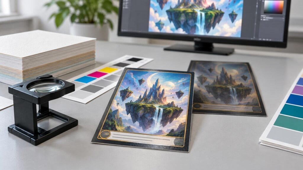
A monitor creates color with emitted light. A printed card is seen through light reflected by ink or toner, the card surface, and any coating or laminate. That basic difference means an on-screen image cannot serve as a literal preview of the finished piece. Display brightness, calibration, ambient lighting, substrate white point, surface gloss, and the printer’s achievable gamut can all affect the comparison.
The problem is especially visible in fantasy illustrations and proxy-style artwork. Deep blue armor, purple shadows, glowing effects, and nearly black backgrounds may look distinct on a bright display but converge into a smaller range of dark printed tones. Neon-like RGB colors can also become less intense when converted into a printable gamut. Color management makes these changes more controlled, but it cannot manufacture colors that the output combination cannot reproduce.
Stock and finish are part of the color result rather than decorative decisions added afterward. A bright stock can make highlights feel cleaner, while a warmer or less reflective surface can change their apparent character. Gloss can increase perceived contrast under some viewing conditions but also introduces reflections. Matte surfaces often feel softer. Transparent or metallic materials introduce further variables because the surface beneath the color may participate in the result. Confirm the live product’s available materials instead of assuming that artwork will behave identically across card types.
Custom trading card color management in plain English
An ICC profile describes how a device or color space represents color. A color-managed application can use profiles to translate colors through a device-independent reference space and into another device’s color space. Rendering intent governs how the system handles colors when the source contains hues or tonal relationships the destination cannot reproduce. These conversions involve tradeoffs rather than a universally perfect setting, as the International Color Consortium’s introduction to ICC color management explains.
Think of a source profile as the label that explains what the artwork’s color numbers mean. The output profile describes the intended printing condition. If the source profile is missing or incorrectly assigned, software can interpret the same RGB or CMYK numbers differently. If an unsuitable output profile is chosen merely because it is labeled “CMYK,” the conversion may not represent the printer’s actual production condition.
This is why converting a file to an arbitrary CMYK profile is not automatically safer. If Printiverse supplies or recommends a product-specific profile or export preset for the selected card, use that instruction. If it does not, ask whether files should remain in an embedded RGB space or be converted to a specified CMYK condition. Do not guess which press, stock, or profile will be used.
For a deeper explanation of device-independent color descriptions, see the Printiverse guide to LAB color, gamut, and print production.
RGB, CMYK, and PDF/X: follow the destination
| File decision | Safer approach | Why it matters |
|---|---|---|
| RGB or CMYK | Use the color space requested for the live card product; preserve the correct source profile where the workflow permits. | The right choice depends on the provider’s conversion and output process, not on a universal rule. |
| ICC profile | Embed or convert according to the printer’s instructions; do not assign a profile just to change the file’s label. | Assigning and converting are different operations and can produce different appearances. |
| PDF/X | Use a specific PDF/X version only when the upload instructions request or support it. | PDF/X standards include different color-handling approaches; the label alone does not prove compatibility. |
| Raster resolution | Prepare image-based artwork at final size and at least 300 DPI unless the live specification says otherwise. | Enlarging a low-resolution image or changing its metadata cannot restore missing detail. |
| Proof | Review content and geometry digitally; use a physical proof when the material or close color judgment warrants it. | A digital preview cannot reproduce the card’s reflective surface or viewing conditions. |
Printiverse’s artwork guidance recommends final-size image artwork at a minimum of 300 DPI, along with bleed for edge-to-edge designs and a safe area for important content. It also notes that proofing may reveal setup problems but cannot turn a blurry source image into a sharp one. Check the current trading-card sizes and specifications and then download the template associated with the product being ordered; do not transfer measurements from a different card format.
Adobe documents both embedded-profile workflows and PDF/X color-handling options. It also cautions, in effect, that useful soft proofing depends on the display, profiles, application configuration, and viewing environment. Adobe’s color-management documentation is a useful reference for the controls, but the printer’s current export requirements should decide which settings you use.
A safer prepress workflow for card artwork
- Select the exact card product first. Obtain its current template, upload requirements, bleed, safe-area guidance, supported file types, and color instructions.
- Set the document to the final production size. Extend edge-to-edge backgrounds through the specified bleed while keeping text, icons, rules, and identifying marks inside the safe area.
- Keep a color-managed master file. Retain layered or editable artwork separately from the flattened upload file so later corrections do not require degrading or repeatedly converting the original.
- Confirm the source profile. Avoid opening, saving, and converting the same artwork through multiple applications with inconsistent color settings.
- Inspect shadows without relying on a bright screen. Temporarily reduce display brightness and examine whether adjacent dark objects remain distinguishable. Use histogram or channel information where available, but judge the actual composition as well.
- Check small type and line art at final physical size. Fine reversed text, dark-on-dark labels, and delicate rules are less forgiving on a compact card than in a zoomed-in screen view.
- Export once using the requested settings. After export, reopen the delivered file and inspect page size, front-and-back order, fonts, transparency, overprint behavior, image quality, and profile information.
- Review the production proof rather than approving from the design application alone. Check every unique front and back in a multi-card set.
Printiverse allows buyers to upload custom front-and-back designs or create cards through its online designer. The appropriate path depends on the project, but externally prepared decks need particularly careful file naming and pairing. For larger sets, create a manifest that maps every front to its intended back. The bulk custom trading-card planning guide covers organizational decisions that become more important as the number of designs grows.
How to prevent muddy shadows and blocked-up blacks
The best correction usually happens in the artwork, not through a last-minute global brightness increase. First identify which dark elements must remain visually separate: a character from the background, black text from a colored panel, or texture within a frame. Build enough lightness, hue, or saturation difference between those elements that the distinction does not depend on a luminous display.
Avoid treating “black” as one interchangeable swatch. A dark illustrated area, a large black background, and tiny black text perform different jobs. Small text generally benefits from a simple, stable construction that avoids unnecessary multi-channel registration demands, but the exact ink or toner recipe should follow the printer’s specifications. Large dark areas may need a different treatment. Never substitute a generic rich-black formula without confirming that it is suitable for the production workflow.
Also inspect each color channel for hidden problems. Dark artwork copied from several sources can contain uneven channel noise, compressed gradients, or clipped shadows. Increasing total brightness may reveal the image but flatten its atmosphere. A better edit often protects the deepest anchor points while opening the mid-shadows and separating the subject locally.
Borders, trim, and other card-specific risks
A perfectly even border in the file can make normal cutting or registration variation look more obvious on the finished card. Printiverse’s setup guidance specifically warns that borders and tight card formats make alignment variation conspicuous. Wider borders are more forgiving than hairline frames, while an edge-to-edge background can prevent a thin unprinted edge from appearing after trimming.
This is a geometry issue, not a color-profile problem. Color management cannot correct a border that sits too close to the trim line. Use the supplied bleed and safe area, keep critical frame details inward, and assess the card at actual size. For proxy-inspired layouts, verify that small rules text, collector-style data, icons, and dark footer text remain legible without magnification.
Soft proofs, digital proofs, and physical proofs
A designer-side soft proof simulates an output condition on a calibrated or characterized display. It can reveal likely gamut compression, shifts in saturated colors, and lost shadow separation. It is useful only when the selected output profile and application settings reflect the intended workflow. Even then, it remains a simulation. ISO 12647-1 describes process-control parameters used to specify visual and technical characteristics of production prints and simulations, illustrating that controlled proofing involves defined conditions rather than a generic screen preview.
A printer-supplied digital proof serves another purpose. It is well suited to checking content, layout, orientation, front-and-back pairing, and overall design. Printiverse states that its digital proof is not an exact prediction of printed color because screens, display settings, and lighting differ from the finished piece. Do not approve a digital proof under the assumption that its screen color is a contract-level match.
A physical proof is the stronger review path when the tactile material, finish, close visual inspection, or color relationship is important. Printiverse identifies physical proofs as more suitable for those concerns. Availability, cost, production time, and whether the proof uses the final production configuration may depend on the specific order, so ask before building the launch schedule around one. The samples and physical proofs guide explains the distinction between the available review routes.
When matching an existing card or brand color
Do not match an older printed card by sampling a phone photograph of it. Camera processing, lighting, glare, white balance, and the display add uncontrolled transformations. Instead, provide the physical reference when the printer accepts references, identify any formal brand-color specification, and explain which element matters most. Ask whether spot-color matching or measured matching is available for the selected card product rather than assuming it is included.
Even a measured target may reproduce differently when the stock, coating, printing process, or surrounding colors change. If matching is business-critical, define an acceptable tolerance with the provider and request the most appropriate physical proofing path. “Looks close on my laptop” is not a useful production criterion.
Final approval checklist
- The file uses the current template for the exact card product and size.
- All backgrounds extend through the required bleed.
- Text, logos, icons, and essential frame details remain within the safe area.
- Every front is paired with the correct back, and all unique designs are present.
- Raster artwork has adequate effective resolution at final size.
- The source and exported files carry the intended profiles where the requested workflow allows them.
- Dark subjects remain separate from dark backgrounds at realistic viewing size.
- Tiny text, reversed type, fine rules, gradients, and transparency have been inspected in the exported file.
- The proof has been checked for content, orientation, crop, and layout—not treated as an exact screen-to-print color promise.
- Stock, finish, coating, and physical-proof options have been confirmed when they materially affect the decision.
The practical takeaway
Reliable custom trading card color management comes from controlling the handoffs: artwork to profile, profile to export, export to production condition, and proof to approval. No single CMYK preset or PDF/X label replaces those decisions.
Begin with the live custom trading-card ordering options, obtain the applicable template, and confirm the requested color and export workflow. Then protect shadow separation, design borders for realistic trim tolerance, and choose a proof based on what must be validated. A digital proof can catch expensive content errors; when color, stock, or finish is central to the project, ask about a representative physical proof or sample before committing to the full run.
References
- Introduction to the ICC profile format — International Color Consortium
- Artwork & File Setup Guide – Printiverse
- Color-managing documents, Adobe Acrobat | Adobe Acrobat
- Custom Trading Cards – Printiverse
- ISO 12647-1:2013 – Graphic technology — Process control for the production of half-tone colour separations, proof and production prints — Part 1: Parameters and measurement methods
- Samples And Physical Proofs – Printiverse